When a bunch of talented weavers get together for a workshop?
Well, for example, this...

And this...

And this!

The workshop, "Echo and Jin for 4 Shafts and More," aims to help weavers explore various tieups and treadlings for Echo and Jin (Turned Taqueté) in either 4 or 8-shaft threadings. I taught it at the New Hampshire Weavers' Guild in Concord, NH, this month and discovered there was more to the lesson plan than I thought.
Turns out, the workshop is as much about exploring color as it is about structure. Participants have the choice of working with a 2-color warp or a 4-color warp -- and with either choice, the weft colors make a big difference in the final results. This can be surprising, especially when you consider that both Echo and Jin are warp-emphasis designs.
(For both weaves, the recommended sett is somewhere between that for twill and double weave. And the weft yarns for Echo and Jin are typically finer -- usually half the grist -- of the warp yarns. So while these are not warp-faced fabrics, such as Rep, they are certainly warp-dominant.)
So, back to color and how important weft colors are to the final look.


In preparing for the workshop, I spent a lot of time weaving up samples and coming up with rules for choosing 4 colors for your warp. Turns out, the above examples did NOT follow any of my rules and they worked out beautifully!
Anyhow, for what it's worth, here's the gist of what I came up with.

See the dark-gray square labeled "Tetrad" on the color wheel? My theory is that 4-color warps work best when you choose colors from each point on this square: in this case, starting from the top-left corner of the tetrad, olive green, then (covered up by the lettering on my color wheel) dark teal, then purple, then rust red/brown. Or you can change the value, moving up to the next level of colors on the wheel and, beginning again at the top-left corner of the tetrad: pale olive, light turquoise, lavender, and salmon/tan.
And then there are the color choices for your wefts, which are often counterintuitive. Khaki works well with all kinds of warp colors, as do olive green, navy, dark purple, and even black. One of the key takeaways from this workshop is that you have to move outside your comfort zone in choosing colors, because the end results are seldom predictable.
I started joking that I was going to rename the workshop, "You Can't Judge a Warp by Its Color." And it's true! Some color choices are unusual and wonderful: for instance, my host, Molly McLaughlin, hand-painted two warps in Kelly green, bronze, and black and beamed them together for her samples. After experimenting with a number of weft colors, she chose a dark purple, with stunning results.


Well, for example, this...

Jin on 4 shafts woven by Jill Hunter
(a design I created called "Blooming Leaf")
And this...

8-shaft Echo pattern, "Chakras," woven by Kathy Hutchins
And this!

"Chakras" design using a different tieup and treadling,
woven by MaryAnn Bennett
The workshop, "Echo and Jin for 4 Shafts and More," aims to help weavers explore various tieups and treadlings for Echo and Jin (Turned Taqueté) in either 4 or 8-shaft threadings. I taught it at the New Hampshire Weavers' Guild in Concord, NH, this month and discovered there was more to the lesson plan than I thought.
Turns out, the workshop is as much about exploring color as it is about structure. Participants have the choice of working with a 2-color warp or a 4-color warp -- and with either choice, the weft colors make a big difference in the final results. This can be surprising, especially when you consider that both Echo and Jin are warp-emphasis designs.
(For both weaves, the recommended sett is somewhere between that for twill and double weave. And the weft yarns for Echo and Jin are typically finer -- usually half the grist -- of the warp yarns. So while these are not warp-faced fabrics, such as Rep, they are certainly warp-dominant.)
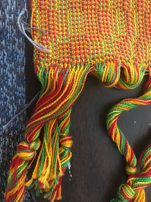
So, back to color and how important weft colors are to the final look.

Mary Ellen Burnett took this photo to document her weft colors.
The pattern is "Blooming Leaf" on 4 shafts.
The photo above demonstrates how varied the samples can appear depending on the weft yarns. And this doesn't even touch on variations in the patterns themselves, as you change your tieup and treadling.
For the four-color warps, which create what Stubentisky calls "iridescence" in her book, Echo and Iris, students chose a wide array of hues and values. Here are some examples.

10/2 cotton warp in gray, black, sky blue, and yellow

10/2 cotton warp in burgundy, turquoise, yellow and sage

10/2 cotton warp
in bright green, red, yellow, and orange
Anyhow, for what it's worth, here's the gist of what I came up with.

See the dark-gray square labeled "Tetrad" on the color wheel? My theory is that 4-color warps work best when you choose colors from each point on this square: in this case, starting from the top-left corner of the tetrad, olive green, then (covered up by the lettering on my color wheel) dark teal, then purple, then rust red/brown. Or you can change the value, moving up to the next level of colors on the wheel and, beginning again at the top-left corner of the tetrad: pale olive, light turquoise, lavender, and salmon/tan.
And then there are the color choices for your wefts, which are often counterintuitive. Khaki works well with all kinds of warp colors, as do olive green, navy, dark purple, and even black. One of the key takeaways from this workshop is that you have to move outside your comfort zone in choosing colors, because the end results are seldom predictable.
I started joking that I was going to rename the workshop, "You Can't Judge a Warp by Its Color." And it's true! Some color choices are unusual and wonderful: for instance, my host, Molly McLaughlin, hand-painted two warps in Kelly green, bronze, and black and beamed them together for her samples. After experimenting with a number of weft colors, she chose a dark purple, with stunning results.

Molly McLaughlin wove a 4-shaft pattern called "Op Art"
using two hand-painted warps for her two warp colors.
Molly is a master weaver and dyer whose work -- creating weave-scapes using a Theo Moorman technique on hand-painted 240/2 silk warps -- has won many awards, including "Best of Show" for the 2019 Complex Weavers exhibit in Reno, NV. I had the good fortune of dyeing a silk noil warp under her guidance, and here's how it looked while still wet:

Looks like a watercolor painting of a lake shore in autumn...
Molly was concerned that my colors looked muddy -- and I responded that I like them muddy! I am very happy with the results and I learned a lot from her.
Our friend Deb Kaplan -- another wonderful weaver who belongs to the Complex Weavers study group in fine threads -- joined us for our dyeing session. And in between, we managed a walk along the seashore near Molly's home in New Hampshire.

Now I know where Molly gets her inspiration!
Color and pattern are everywhere we look. And we respond powerfully to touch, to the textures in our weavings. What happened in New Hampshire is what happens when weavers get together and do what they love to do.
Thanks for reading!
4 comments:
What are Mary Ellen Burnett’s warp colors in the sample where she shows the bobbins of weft colors? (The long photo) thanks.
They were fuchsia, orange, Kelly green, and navy! Her samples were beautiful -- very warm colors.
Correction: it wasn't a navy color -- it was more like a periwinkle blue. Just wanted to be accurate ;o)
Thanks!!
Post a Comment