 |
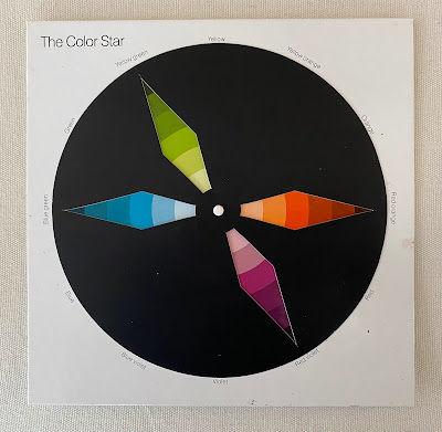
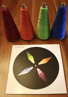
In 1921, Johannes Itten -- a painter and teacher at Germany's famed Bauhaus School -- published The Color Star, a small book featuring a 12-point color wheel that's been valued by artists ever since. The book included eight templates that one can place over the color star, displaying a variety of what he termed "color chords". Every point on the star represents one color in the spectrum, and every color is shown in a range beginning with the lightest tints (white added) and moving outward to the three darkest shades (black added).
The pure colors are in the center band of the circle.
 |
| Itten's Color Star |
Itten's first template shows you the two-tone Dyadic Chords, giving you all of the complementary colors: yellow/violet, yellow-orange/blue-violet, orange/blue, red-orange/blue-green, red/green, and red-violet/yellow-green.
His Triadic Chords can be created using either isosceles or equilateral triangles, as seen here with the template for an equilateral triangle (and some yarn possibilities).

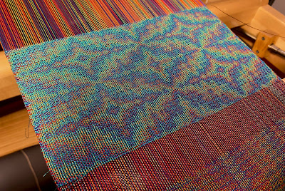
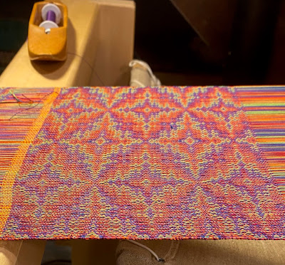
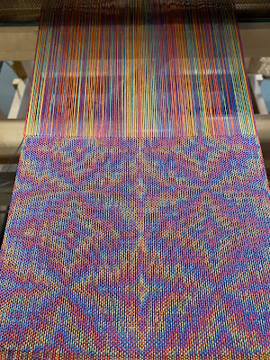


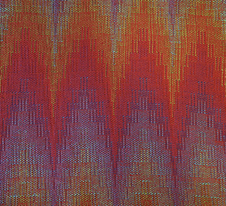

Without going into more detail, I'll get to the point: I use these chords to choose warp colors for extended-parallel threadings, which use two, or three, or four colors in the warp. The results can create beautiful iridescent shifts in the fabric. Like this sample, using a four-color parallel threading on eight shafts with a turquoise weft.

Or this variation, with a burgundy weft:

Or this, with a violet weft:

For the warp colors, I used the one of the templates for Itten's Quadratic Chord, which can be a square or a rectangle. In this case, I chose the square and based on this I went with saturated colors. Go big and bold or go home, right?

The samples will be used in a workshop I'm presenting at MAFA this June: "Echo and Jin: Playing with Color Chords". My aim is to familiarize weavers with Itten's objective theories about color chords and then let them choose their own colors within that framework.
Everyone's rods and cones are different, we know. Not everybody likes olive in their warp, correct? These subjective decisions are what makes our creations unique.
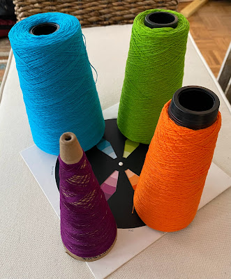
Here's the warp I'm threading right now, using a Quadratic Color Chord that's a rectangle rather than a square.


It will be used with a 12-shaft pattern -- and I really love these colors. Consider that you're looking at two sets of complements: blue/orange and green/red (except in this case the red tilts more toward a berry color).
My next plan is to try a trapezoid as a color chord. Itten doesn't offer that in his templates, but I think it's worth trying. Mother Nature seems to range freely and quite joyously around the spectrum, so why can't we?

This discussion doesn't venture into the importance of value. At this point, without having focused on this topic, my thinking is that it's best to avoid extreme differences in value in a parallel-threaded warp, particularly in a four-end parallel-threaded warp. Some differences in value are OK, but I try to avoid colors like navy, deep purple, forest green, and the like -- or, on the other side of the value scale, yellow, beige, pale pink, baby blue, silver, that range of hues.
Why? Because the warp color with a very dark value may tamp down the effect of iridescence, while a warp color with a very light value may overwhelm the other colors -- sort of like a singer in a quartet who is louder than anyone else.
Looking at values, here's what I chose for my first warp (the one I wove on eight shafts, samples shown at the beginning of this post).


The red on the far left is darker in value than I'd like -- and surprisingly, it's darker in value than the blue on the far right -- but I went with it anyway because that's what I had in my stash. (That can overrule a lot of rules.) Still, if you look back at the samples at the top of this post, it seems to work well.
Another question: What do we choose for weft? Sampling is so important for this, of course. Typically, I start any project by winding a warp that is about a yard longer than I need for the finished piece and then I use the first yard or so to experiment with different weft colors.
When I'm weaving Echo or Jin on a four-end parallel, I tend to use muted colors in mid-range values, such as bronze, violet, teal, olive, mustard, terra cotta, even gray. Also, as a rule of thumb, you'll want to use colors that do not appear in the warp -- that is, colors that are found in between the colors you've chosen from the color wheel.
Then again, for every rule there seems to be an exception, as you see in the fourth photo down from the start of this blog post. For that sample, I used a bright turquoise weft. I love turquoise and find that I often default to that color, for warp or weft.
Itten would say this is a subjective choice, of course.
Thanks for reading!

Doubleweave on 16 shafts
using a four-end extended-parallel threading


