Pictured above, "Tesselations": an eight-shaft design on a four-color Echo threading. This is one of the samples I'm weaving up for "Echo and Jin: Playing with Color Chords," a workshop I'm teaching at the MAFA (Mid-Atlantic Fiber Association) 2023 conference in June in Millersville, PA.
Weavers will choose their warp colors based on the theories of "color chords" presented by Johannes Itten, author of The Art of Color and The Elements of Color. Many consider him to be the 20th century's master of color theory.
In addition, The Color Star (John Wiley & Sons, Inc.,1985) is a tool for color study based on Itten's theory of color harmony and his 12-point color wheel. The kit (not really a book) includes eight templates that outline a series of chords of his color star. As an example, looking at the photo at the top of this post: The colors of the warp yarns (in 10/2 mercerized cotton) are bright green, orange, burgundy, and royal blue. Together, they form a rectangle, a quadratic chord, on Itten's color star.
The full complement of templates, placed over the color wheel and cycled around the wheel, are as follows:
1) Dyadic chords, the six sets of complementary colors: yellow and violet, yellow/orange and blue/violet, orange and blue, red/orange and blue/green, red and green, and red/violet and yellow-green.
A dyadic chord showing the complementary colors yellow and violet
2) Triadic chords that form either an isosceles triangle or an equilateral triangle on the color wheel. An isosceles triangle will give you four color chords, among them the primary colors of yellow, red, and blue and the secondary colors of orange, violet, and green.
Triadic chord: an isosceles triangle showing the primary colors
Triadic chords can also be equilateral triangles that yield twelve chords, a.k.a. split complementaries.
Triadic chord showing the split complementaries of yellow, blue/violet, and red/violet. This chord is useful if you're choosing colors for a two-end parallel threading and its accompanying weft -- although if I had a warp of royal blue and magenta I would choose a darker shade of yellow, something more like bronze, because yellow can overwhelm other colors.
3) Quadratic chords that are either a square or a rectangle on the color wheel. (I consider this the barbership quartet of Itten's color theory, which I'm certain would not amuse him.) This is the main part of my subject matter for the MAFA workshop.
Here's an example of a square quadratic chord of warp-color choices, starting at the top left and going clockwise around the wheel: lime green, orange, wine, and royal blue. Unfortunately I didn't line up my yarn cones in that order, but you get the idea....
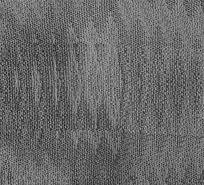
Here's what those colors look in black and white, defining their relative values:
Predictably, the deep wine color has the darkest value and the orange has the lightest value. Here's an 8-shaft sample woven up with these warp colors, using a turquoise weft.
And here's what this sample looks like in black and white, showing the different values of the color blends:
The darkest values, outlining the motifs in the pattern, are where the turquoise crosses the wine and the royal-blue warps, which stands to reason based on the black-and-white photo of the warp yarns.
Looking again at the sample at the beginning of this post: The warp yarns I used are bright green, orange, burgundy, and royal blue. Together, these colors form a rectangular quadratic chord on Itten's color wheel.
Here's a black and white photo showing the values of these colors. You'll see that the burgundy on the bottom left of the photo has the darkest value and the orange on the bottom right has the lightest value.
The different values shape the pattern, defining the forms and adding depth. The burgundy adds a shadow, almost an outline, while the orange/yellow appears to sit on top of the sample.
4) Itten's
five-tone chords combine the equilateral and isosceles triangles. These templates are useful when you're creating a four-color parallel threading, for instance, and you're looking for ideas for weft colors as well.
Five-tone color chord of green, yellow/green, red/orange, blue/violet, and blue
5) Finally, there are two different six-tone chords that are revealed by rotating a hexagonal template on the color wheel, the first one giving you two six-tone chords, each consisting of three complementary colors. Both templates in this category use two equilateral triangles: the first one has all colors equidistant from each other, giving you four different chords to choose from, and the second combines two equilaterial triangles to form an irregular hexagon. These two templates are useful in choosing warp and weft colors for Echo woven as doubleweave, where you have four colors in the warp and two colors in the weft.
Using a hexagonal template for a six-tone chord, I've chosen warp colors that form a trapezoid on the six-tone template -- suggesting, for doubleweave, I should try orange/yellow or blue/green in the weft.
A plug for subjective color choices: Here's a Jin sample where I went rogue and, weaving with the warp colors above, chose hot pink as the weft. Further, I used a wool/stainless-steel yarn in the weft, which gives the fabric pleats (how firm or soft depends on how you shape it, because the stainless steel has memory).
Six-tone chord forming an irregular hexagon (using two equilateral triangles) and showing green, yellow/green, orange, red/orange, violet, blue/violet. These would be great colors to choose for doubleweave, with four colors in the warp and two in the weft.
There's a lot of science involved in how we perceive color and value, obviously. For example, the rods and cones in our eyes allow us to interpret value and color, respectively. Simply put, the rods are more numerous and highly sensitive to light; they work for night vision and peripheral vision. The cones, each devoted to the colors of red, blue, or green, work together to allow our brains to detect the full spectrum. We weave for what we perceive visually in form and color (and substance, which is tactile, but that's another subject).
This is not to say that Itten's chords are hard and fast rules to weave by. (If they were, I would break them a lot.) Instead, I see his theories as objective road maps, a guide when I'm in search of color ideas to achieve interesting color blending for parallel-threaded warps.
Certainly, I believe that subjective color choices are as important -- perhaps more important, who can say -- for our weaving because, after all, if we don't like the colors we're working with, we probably won't like the end results.
Whatever colors we choose -- objective, subjective, analogous, complementary, harmonious, discordant, even black and white, which aren't colors at all -- it's a joy to learn as much as we can, to sample, to gain insights, to venture outside our comfort zone, and then perhaps to return gladly to our comfort zone, a bit more aware of how best to dwell in it.
 |
| Turquoise. Gets me every time. |


2 comments:
Great post--color theory made understandable for all!!! That's a stellar accomplishment.
Thank you! We learn by teaching, right? And for me, it's easier to study color for a specific application -- in my case, parallel-threaded designs.
Post a Comment