Tuesday, May 18, 2021

Vive la Différence -- with Differential Shrinkage


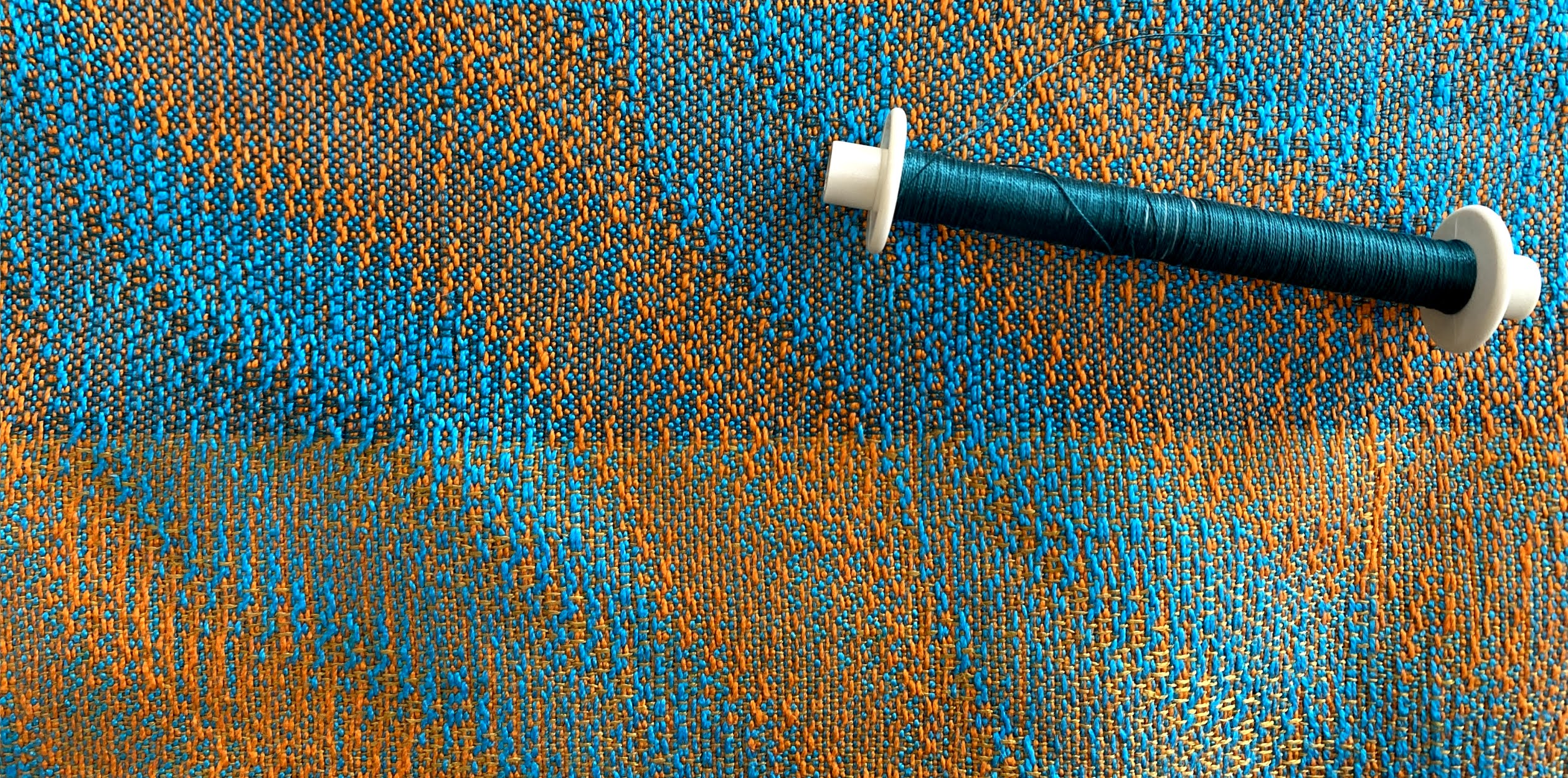
Top photo: handwoven cloth in loom state

Bottom photo: detail of cloth after finishing

"Loom state" describes fabric that has not yet been finished or dyed. In the textile industry, such fabric is also called "gray" or "griege." 

The finishing process is particularly important to weavers because, as I like to say, "It ain't over till it's finished" (with a nod to Yogi Berra). Woven fabric isn't ready to use until it's properly washed. Unfinished or unwashed, it will retain some of the tension that it was under during the weaving process and thus won't feel or behave optimally.

Differential shrinkage takes the process one step further, creating a puckered or pleated fabric, using warm water, gentle soap and lots of agitation by hand or machine. With this technique, one block or group of yarns (such as the turquoise 18/2 merino in the photos above) will full and shrink while the other (the 10/2 cotton in gold) doesn't, creating lots of texture and visual interest.

Deflected Double Weave works well for differential shrinkage because of the plentiful floats and open spaces that alternate with blocks of plain weave. By definition, it has two layers that weave in and out of each other (but never on top of each other, hence the term "deflected").

When I posted some photos on Facebook -- after fulling to create differential shrinkage -- one weaver thought the fabric was stitched double weave. I explained that it only appeared that way because the layers of wool fuse together and the cotton relaxes, losing the gaps between blocks and appearing as if it were one layer.

Here's what the back of the fabric looks like before finishing -- that is, in loom state. (My apologies for the fuzzy image, but I was using my iPhone in reverse to photograph the underside of the fabric while it was on the loom.)


And here's what it looks like after finishing. The cotton blocks in plain weave look almost like they are one layer -- while, before finishing, there are vertical gaps in between the blocks (where the wool blocks are weaving on the other side).


Here are sections of the drawdowns (front and back respectively), which give you a better idea of how the blocks of wool (in blue) might fuse together in the finishing process, making the blocks of cotton (in gold) appear as a single layer. (The technical term here is "fulling" rather than "felting," because we are fusing yarn rather than raw fiber.)


I know there's probably some vibration between the colors in the drawdowns, because they are close to being complementaries -- which is what I wanted! I love the energy of combining opposites or near-opposites on the color wheel.

I proceeded to weave up a number of samples before I cut off the fabric and washed it -- so here are a couple of "before washing" and "after washing" photos.


Back of fabric before washing


Back of fabric (now upside down) after washing

My son, who took both photos -- thank you, Jake -- thought that it looked better BEFORE there was any differential shrinkage. I can see his point, where the fabric may look tidier and more elegant before fulling. After fulling, it might appear to some as messy and wrinkled.

But I like it that way! Differential shrinkage just appeals to me. And there's more to come, as I have maybe 3 yards left on the loom, keeping in mind that 3 yards will shrink down some.... I'm hoping to weave a scarf using these two patterns in sequence.


Thanks for reading!


Wednesday, April 28, 2021

Titian, Caravaggio, El Greco, Velázquez, Rembrandt, Chagall... and Linen Tablecloths


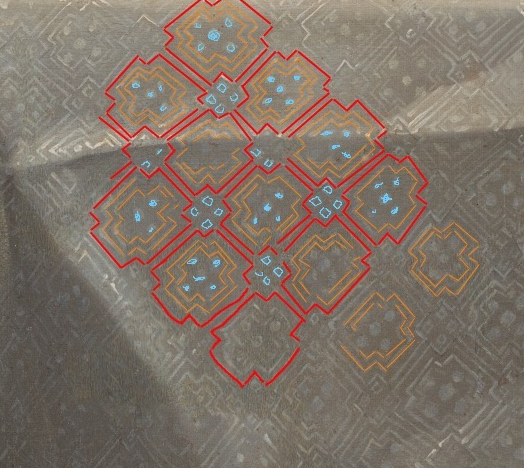
Titian, The Supper at Emmaus, circa 1530


Analysis of the pattern of the tablecloth in the painting,
courtesy of Helena Loermans


A weaving drawdown similar to the tablecloth pattern

A few months ago, I wrote a post about a weaving pattern known as "The Earl's Canvas" -- a 14-shaft Gebrochene design that had been discovered in a 17th-century painting of the second Earl of Mar in Scotland. The painting was of less interest to weavers, actually, than the pattern of the canvas itself, which had been a tablecloth, most likely linen.

A linen tablecloth! I assumed that the poor artist had no choice but to use a table linen instead of a real canvas. Little did I know. 

Recently, through a chance conversation with someone in a workshop I taught, I learned that there are many centuries-old paintings woven on tablecloths in similar patterns -- patterns that are described in weaving terminology as twill diaper design. 

My friend pointed me to the writings of Helena Loermans, who researches these canvases and has a blog devoted to her work: labo.pt. (The full name for the project is the Laboratory for Handwoven Canvas Odemira, based in Odemira, Portugal, where Loermans has lived for some 30 years.)

Her research, to date, has looked at masterpieces by Titian, El Greco, Caravaggio, Velázquez, Rembrandt and Chagall. Weaving on an AVL computer loom, she recreates their canvas patterns in fine linen, emulating and revealing the beauty of the original fabrics.

Reconstructions of canvases used by Titian, woven by Helena Loermans

She also offers gift boxes of her reconstructions for sale, to raise funds for her research -- available by clicking here.

I reached out to Loermans via Zoom and asked her why these masters were using such fabrics for their work. She responded that, while no one yet really knows why, she theorizes that tablecloths were among the few fabrics wide and long enough to serve, without seams, as canvases for large paintings. (Loermans suspects that these linens were in fact seamed, but so expertly that no one can detect it.) 

In a larger sense, the material of the canvas might have been a reflection of the value of the painting. We explored how, just as art deserves a beautiful frame, the culture of the time may have viewed the canvas itself as a statement of luxury and status. Loermans observed that fine linens were often owned by churches, in an age where the church and the nobility were closely linked -- and were perhaps the only groups that could afford great works of art.

An interesting footnote: Loermans told me that the oldest known record of weaving drafts is a collection from 1677 by Marx Ziegler, Weber Kunst un Bild Buch (roughly translated, "The Weaver's Art and Drawing Book"), which is available on Handweaving.net. The collection holds many patterns similar to those she has reproduced.

In conclusion, for your weaving delight, here is a painting by Velázquez, along with a drawdown of the pattern of his canvas.

 Velázquez, Supper at Emmaus, 1599-1600

Weaving drawdown, courtesy of Helena Loermans

Thanks for reading!


Friday, March 19, 2021

How Many Samples Does It take to Get It Right?


Answer: As many as it takes. 

Which is kind of discouraging but, as they say, the truth hurts ;o)

The sample above is the best one, but it's the final one: it took me five other samples to get there! It's a 6-shaft Deflected Double Weave design that I'm working on. I want to weave what I'm calling a "Puzzle Scarf," just because it looks like a lot of fun.

I love the complexity of it and the mystery of how this can be done on 6 shafts. I also love the texture of this piece: It starts out as gauze on the loom, but when you full it with hot water, soap and agitation, it turns into a pretty indestructible piece of cloth.

Here's what it looks like on the loom:


And here's what it looks like before fulling:


The process of fulling for this is fairly detailed, as you have to take the piece out of the water, wring it out and lay it out flat about every half minute in order to make sure that none of the "puzzle parts" stick together. You really want to define the image of three intertwining layers in the cloth. 

So what about all the sampling? Bottom line, it's really necessary for some pieces. I believe that, if you take your work seriously -- that is, if you aim for certain results and you're intent on achieving them -- you have to do what it takes to get there. 

Still, sometimes you have to fight the discouragement that comes with yet another bad sample, yet another re-sleying, yet another re-threading.... I think, as a weaver or a fiber artist, you do understand!

OK, the first sample. I wound a warp of 18/2 superfine merino from JaggerSpun in three colors, as you can see: red, burgundy, and purple. My sett was 24 epi in a 12-dent reed but I had to sley the reed with empty spaces between the colors to get the effect I wanted.

In the case of my first sample, I sleyed 6 ends per color and left 2 empty dents between each color. Which, after fulling, was too dense for my taste, giving the cloth the hand of a jacket fabric rather than that for a scarf.

Too dense

For my second sample, I overcompensated: I again sleyed 6 ends per color but then left 4 empty dents per color in a 12-dent reed. 

Looks like a confusing but colorful fishing net.

The trouble in this case was that my motifs were elongated (if you look carefully at the red warp and weft, for instance, you'll see long rectangles rather than squares). So my beat was off. And the cords that formed after fulling were way too thin, which meant that I had to re-thread from 6 ends per color to 12 ends per color.

Which I did, and came up with this.

OK, so we're looking better, but still the motifs vary in shape.

My next thought was to re-sley so that there were just 3 empty dents between each color. And to try to beat more steadily so that each color formed a square (looking at both warp and weft together).

Better yet, but the cords are still too thin for me.

Back to the heddles, re-threading so that I would have 18 ends per color, still leaving 3 empty dents between each color.

Now we're getting somewhere -- but the cords aren't fully fulled ;o)

Understand that, with each sample, I was learning a lot and I was gaining practice. I realized through this process that -- because this cloth is kind of a messy-looking fabric, with organic shapes and spaces in between the plain-woven blocks -- I had to finesse some of the details. I had to make it as tidy as possible, you might say. To me, this meant fulling the cords till they were solid (which involved sometimes cutting a wayward thread or two after fulling). 

I think the results are worth it. But I have to confess, now I'm at the end of the warp! I have no warp left to weave that scarf I was planning, which adds yet another step to the project: re-winding another warp and re-dressing my loom. I'm not entirely unhappy with this, as I want to try different colors next time.

Thanks for reading!


Sunday, February 21, 2021

Learning Curves


Learning curves, plural. For example: In the photo above -- a networked Echo threading on 32 shafts -- can you see two threading errors? I will give you a clue: They're pretty obvious ;o)

These are just two of nine, count 'em, nine threading errors in this project so far. I've named it "Learning Curves" because it's the inaugural project for a new-to-me 32-shaft Louet Megado.

I am thrilled, to say the least, to have this loom. However -- and this is a big however -- it may be 15 to 20 years old and may have sat unused for the past four years or more. Which means that, not only did I have to up my game to weave on such a complex machine (which meant hours and hours of designing on Fiberworks), but the loom itself had to be reconditioned, basically. (Spouses are useful in this regard, particularly if they are smart and willing to help out.) And learning how to recondition it involved making mistakes, lots of mistakes, in the process of weaving this first design.

For instance, ends fraying and breaking at the left selvage: Too much draw in (which I should know enough to avoid). My answer was to go easier with the shuttle and, more important, to use my lovely Bluster Bay end-feed-delivery shuttle, which really makes a difference on the "drag" of the weft against the selvages.


And then I needed Texsolv cord. Lots of it.


Texsolv: Don't weave home without it.

I needed -- well, rather, WE needed -- lots of Texsolv because the cords that ran the pulleys that connected to the dobby box that lifted the shafts... kept breaking. But what we didn't know was that, more than Texsolv, we needed Teflon spray to un-gum-up all the pulleys. 


Teflon spray: It works.

We did lots of consulting, too, primarily through that brainy listserve known as WeaveTech (weavetech@groups.io, an invaluable resource for all questions weaving). There I learned how to get in touch with Dave Vanstralen, president of Louet Looms, who got back to me immediately and gave me lots of pointers on how to get this ship out of dry dock. And then there was Mimi Anderson, president of Complex Weavers, who pointed out to me that I should actually check back on WeaveTeach to look at all the answers people had posted. And Fran Osten (www.danforthweavers.com) who suggested using heat-shrink tubing to protect the Texsolv cord from abrading when it meets a screw that's attached to one of the pulleys.


Heat-shrink tubing, which we haven't used yet, because painter's tape is doing the job. 

I won't bore you with a photo of painter's tape! And I may be boring you right now, if you've read this far, because this is a blog about weaving and I haven't shown you any weaving.

Well, long story slightly shortened, I am finally weaving. There is just one more threading error to fix, but here is where I am at this point, weaving an Echo design on 32 shafts.

This same is the same tieup and threadling as the design in the first photo of this blog post -- but here the weft is an azalea-colored 20/2 cotton.

I didn't mention that the warp comprises two highly saturated complementary colors in 10/2 cotton:


These are colors I would not ordinarily have chosen for an Echo warp, but that my previous blog post discussed the use of complementaries with Echo designs. I was thinking out loud about how complementaries can add so much energy and interest to a weaving -- and so I decided to go full bore with these striking colors. Not pretty, but striking.

I really like the results so far.


The top sample uses a dark forest green/emerald weft in 20/2 cotton, while the bottom portion uses a gold/khaki-colored linen singles that I don't think works as well as the cotton.

After this, I hope to do more samples: another Echo design, a few in Jin and a couple in double weave. I'm hoping to try some differential-shrinkage techniques with one of the double-weave designs. Here's the drawdown I'm thinking will work for pleating and puckering.


Meanwhile, I will keep the Teflon spray nearby. Thanks for reading!


Monday, January 18, 2021

Why Do We Love Complementary Colors?


Color choices in weaving -- choosing from the untold number of hues in the yarns and dyes available to us -- are among the most valuable decisions we make as weavers. Color can transform a well-known, often repeated weave structure and turn it into something interesting, illuminating, even heartening. 

For an example, take a look at the photo above: It's a simple turned twill on 8 shafts, woven with a hand-painted 5/2 Tencel weft on a hand-pained 60/2 silk  warp. To me, the glow of the yarns, combining an electric blue and a coppery orange, makes for a visually appealing fabric. Nothing fancy going on here, really, just a juxtaposition of complementaries.

It's amazing to me how complementary colors -- those that lie across from each other on the color wheel -- have such immense appeal to our eyes and spirits.


Farbkreis by Johannes Itten, 1961

Nature understands this, of course. 


Leaves of green and magenta


Blues and rose-golds of a sunset


Rose bushes with pink and green

Why are these combinations so beautiful? Science tells us it has to do with the photoreceptor cells in our eyes -- the rods and cones that interpret color for our brains. Rods can detect light and dark, while cones detect colors. And it seems that, if these receptors become overstimulated, they seek to return to normalcy. 

We all know about the after-image effect: When you stare at a bright color for a while and then look away, you will see a ghost image of its complement on the color wheel.


Stare for a few seconds at the green geese on a red background, then look away. 
You will see an after-image of geese in magenta on a blue background.

It's as if our eyes seek balance, as if a marriage of opposites is soothing to our senses. Our eyes look for harmony. At least that's my interpretation. 

So what does this mean for our weaving choices? It all depends, of course, on which technique we are using, what effects we seek and what color combinations we ourselves enjoy, as everyone's rods and cones are different. 

But if I can speak for one technique -- that of choosing warp colors for Echo threadings, where you're threading your loom in two or more alternating colors -- I've come to the conclusion that complementary colors in a warp can produce unexpected and beautiful results in the fabric. It depends greatly on the weft, of course, as it so often does. Here are a few examples, from workshops I've taught.

Most recently, Anne Benson of North Carolina chose these two colors for a workshop I'm teaching, "One Warp, Many Structures: An Exploration of Extended Parallel Threading." 


If you go back to Itten's color wheel, you'll see that these are complementaries: a cherry red and a lime green. And taken at face value, most folks would say that this is an unlikely combination, right? Well, I heartily endorsed her colors for this workshop because I've seen what happens when you start to weave. And here's what happened, using a teal-blue weft.


The fabric now has a softer, more nuanced and very lovely palette, with the chartreuse becoming turquoise and the red becoming magenta. In my view, that's because the teal weft shifts and unites the two complementaries in the warp, serving as a sort of mediator and bringing the opposing colors into harmony, visually speaking. 

Here's another endorsement for using complementary colors in your weaving. In this case, the complements are one of the warp yarns and the weft.

Sample by Sandra Schulz, 4 shafts based on "Blooming Leaf" pattern

Blue and orange working together once again, where a warm red in the warp (what I'm loosely calling orange) works to with the light blue in the weft (which looks almost textured in this photo) to make it seem to pop and glow.

And let me take this one step further, to show you a sample I wove on four shafts using four seemingly discordant colors in the warp.


This is a 4-end parallel threading on 4 shafts.

Here, the four colors in the warp are red, orange, chartreuse and turquoise: two sets of complementary colors (red/chartreuse and turquoise/orange). I'm guessing the weft is a bronze color, which is again a sort of "mediator" among the four, in a medium value and a fairly unsaturated hue.

I don't always practice what I preach, however, which is urging weavers to choose colors out of their comfort zone, understanding that the weft can make such a difference. What happens when I don't follow my own advice?

A fabric like this, which has an attractive pattern (in Echo on 16 shafts) -- but one that is hard to see because the colors are too close in hue and value. The warp colors are royal blue and aqua and the weft is black, if I recall correctly.

Nice, in my opinion, but no cigar

Right now I'm planning an inaugural piece for my new (to me) 32-shaft Megado. I've designed a 32-shaft extended-parallel-threading pattern in two warp colors.

Detail of 32-shaft pattern in Jin

You can't tell, but the warp colors in this drawdown are royal blue and aqua -- the same colors I used for the not-as-successful piece in the prior photo. The weft is a red/orange color, a complement to the warp colors, which makes it work. 

I originally planned to go with these two colors for my warp.


These are what you call "analogous colors," meaning that they are near each other on the color wheel. And yes, they will work for an Echo design -- but I'm thinking that, based on my recent experience, they won't create an exciting design, even when woven with a complementary color in the warp. It's a safe choice, you might say.

So I decided to take my own advice and make my warp-color choices by thinking out of the crayon box. And here's what I'm using.


Colors of a sunset, way out of my comfort zone...

I will keep you apprised, hopefully in my next blog post. Thanks for reading!


Monday, December 21, 2020

More Explorations in Extended Parallel Threadings

Pictured here: a 12-shaft design woven on an Echo threading in 20/2 silk. I call this design "Burano" because it has a lacy look, reminding me of the lace-makers on the island off of Venice. 

So let's walk through the steps in creating this design and weaving the different samples in Echo, Jin, Shadow Weave, Rep and Double Weave. (This is exactly what we do in my workshop, "One Warp, Many Structures: An Exploration of Extended Parallel Threading." I must really like the process, because I keep repeating the format on my own, at home....)

First, how to create the design itself? I think I found the original pattern, a twill pattern with elements of a Crackle threading, on Handweaving.net. Can't remember, exactly, because it could also have been on Pinterest. Both are great places to scan weaving drafts for ideas. Here's what the original draft looks like.


Intricate, symmetrical, appealing -- reminds me of a butterfly! I starting playing on Fiberworks, expanding the design to 12 shafts using an extended parallel threading. And this is one of the designs I came up with: an Echo tieup on an advancing and descending twill treadling.


Following one of my other workshops -- "Paint Two, Beam One" -- I hand-painted two warps of 20/2 silk. The first was in a range of blues and the second in purples and rose colors, but I decided I needed more color, so I added two more painted warps in complementary colors, creating four stripes bordered on both sides by two ends of black. And here's how it wove up. 


This sample is the same pattern as in the first photo of this blog post. I used a bronze-colored weft in 20/2 cotton, because the gold tones really warm up the overall tones of the warp. And then I proceeded to weave up samples in Echo, Jin, Shadow Weave, Rep and Double Weave, varying my tieups, treadlings and weft yarns, all on the same extended parallel threading.

I am so grateful to my weaving teachers, particularly Bonnie Inouye and Marian Stubenitsky. I first learned about the potential of extended parallel threadings through a workshop taught by Bonnie, "Opposites Attract," in which she explores the potential of Echo threadings to achieve a broad range of structures. And I also continue to learn from Marian Stubenitsky's definitive work, Weaving with Echo and Iris, in which she took Echo designs and ran with them, showing countless possibilities for variations on 4 to 32 shafts.

Here's how my Jin sample wove up, offering yet another example of why I love Jin so much:


And here's how the threading works with Shadow Weave, shown here in a detail:


As for Rep (below): Well, not so great, but I think it was partly owing to my choice of wefts, where I alternated 20/2 cotton (thin weft) and black rayon chenille (thick weft). I think this sample would have been better if I changed my sett, making it much denser, and chose something thicker and less textured than the chenille for the thicker weft. Nevertheless, I see some potential here!


And then I wove up a double-weave sample, which I also like very much:


Just one more, this one in another variation of Echo:


Subtle, yes, but still I like it -- particularly the way the diamond shapes change in both size and color throughout the stripes.

Weaving at home and teaching weaving on Zoom have both given me great comfort this past year. And we all need comfort, even as we are painfully aware of how others lack food, shelter, health care and health itself. This year has given us hardship and hope in equal doses. Friends and loved ones are farther away and closer in our hearts. May you and yours enjoy the blessings of this season of light, however you may celebrate, and may you take comfort in every way you can in the year to come!