
In a way, the design is hard to see, isn't it? That's been the problem. This is a 16-shaft Echo pattern on a 60/2/2 silk/ramie warp that I dyed in two color palettes. (I really love doing this: You paint two warps in complementary colorways and then beam them together on the loom. For this Echo piece, I threaded the warps A/B/A/B, etc., so that the pattern and the colors create a lot of dynamic shifts.)
I was really excited as I completed this design, which I call "North Star" in honor of the newspaper edited by Frederick Douglass when he lived here in Rochester, NY, in the mid-19th century. Rochester was a stop on the Underground Railroad and the North Star itself was a beacon for slaves fleeing to the northern states and Canada. It's a beautiful and tragic symbol of hope in dark times. And meaningful, too, at this point in our history.
And so, after lots of experimenting on Fiberworks, I settled on a Jin (Turned Taqueté) design. I'm posting it here in black and white -- because it's really hard to see the pattern in color, the values are so soft.

I really loved the design -- but when I wove it up I could hardly see it. Here are two samples, using a 20/2 cotton weft in olive green (bottom of photo) followed by a sample using a weft of teal blue (top of photo).

The back of the fabric (still on the loom) gives you a slightly better representation of the colors.

Close, yes, but still not exactly what I was going for. This happens all the time to me: I work and work to create a design I like in Fiberworks, but I have to keep in mind that it won't necessarily translate well on the loom. There's a lot of tweaking involved: sett, beat, the grist of the weft yarn, the color of the weft yarn, which treadling and tieup to use....
So many options! Does this happen to you? Sometimes I wonder if I'm just chasing a carrot in front of my nose, always seeking that perfect design. Don Quixote would understand....
But onward. Keeping in mind what I say when I teach -- that Jin can soften a design, making it look like it has a sprinkling of dusting powder over it -- I decided to try the Echo version of this threading, avoiding the tabby tie-downs in the Jin treadling, which can obscure the pattern.
Here's what the Echo drawdown looks like in black and white, again to show you how the motif plays out.

To my eye, this design is stronger and a bit more graphic. And I was much happier with the result. Below is another view of the sample at the beginning of this post, woven with a light aqua weft in 20/2 cotton.
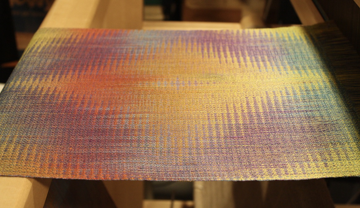
So often with Echo and Jin, the pattern looks bolder when you peer at it from the side, at a low angle, as in this photo. And by the way, I'm really happy weaving on a silk/ramie warp, because it has both a luster (silk) and a grit to it (ramie). Soft cocoons and bristly nettles together. Sort of like the experience of weaving itself ;o)
I hope to have a scarf finished before I teach my next warp-painting class. Oh yes, and I had to order more of the aqua weft yarn....
Thanks for reading!
No comments:
Post a Comment