Monday, January 18, 2021

Why Do We Love Complementary Colors?


Color choices in weaving -- choosing from the untold number of hues in the yarns and dyes available to us -- are among the most valuable decisions we make as weavers. Color can transform a well-known, often repeated weave structure and turn it into something interesting, illuminating, even heartening. 

For an example, take a look at the photo above: It's a simple turned twill on 8 shafts, woven with a hand-painted 5/2 Tencel weft on a hand-pained 60/2 silk  warp. To me, the glow of the yarns, combining an electric blue and a coppery orange, makes for a visually appealing fabric. Nothing fancy going on here, really, just a juxtaposition of complementaries.

It's amazing to me how complementary colors -- those that lie across from each other on the color wheel -- have such immense appeal to our eyes and spirits.


Farbkreis by Johannes Itten, 1961

Nature understands this, of course. 


Leaves of green and magenta


Blues and rose-golds of a sunset


Rose bushes with pink and green

Why are these combinations so beautiful? Science tells us it has to do with the photoreceptor cells in our eyes -- the rods and cones that interpret color for our brains. Rods can detect light and dark, while cones detect colors. And it seems that, if these receptors become overstimulated, they seek to return to normalcy. 

We all know about the after-image effect: When you stare at a bright color for a while and then look away, you will see a ghost image of its complement on the color wheel.


Stare for a few seconds at the green geese on a red background, then look away. 
You will see an after-image of geese in magenta on a blue background.

It's as if our eyes seek balance, as if a marriage of opposites is soothing to our senses. Our eyes look for harmony. At least that's my interpretation. 

So what does this mean for our weaving choices? It all depends, of course, on which technique we are using, what effects we seek and what color combinations we ourselves enjoy, as everyone's rods and cones are different. 

But if I can speak for one technique -- that of choosing warp colors for Echo threadings, where you're threading your loom in two or more alternating colors -- I've come to the conclusion that complementary colors in a warp can produce unexpected and beautiful results in the fabric. It depends greatly on the weft, of course, as it so often does. Here are a few examples, from workshops I've taught.

Most recently, Anne Benson of North Carolina chose these two colors for a workshop I'm teaching, "One Warp, Many Structures: An Exploration of Extended Parallel Threading." 


If you go back to Itten's color wheel, you'll see that these are complementaries: a cherry red and a lime green. And taken at face value, most folks would say that this is an unlikely combination, right? Well, I heartily endorsed her colors for this workshop because I've seen what happens when you start to weave. And here's what happened, using a teal-blue weft.


The fabric now has a softer, more nuanced and very lovely palette, with the chartreuse becoming turquoise and the red becoming magenta. In my view, that's because the teal weft shifts and unites the two complementaries in the warp, serving as a sort of mediator and bringing the opposing colors into harmony, visually speaking. 

Here's another endorsement for using complementary colors in your weaving. In this case, the complements are one of the warp yarns and the weft.

Sample by Sandra Schulz, 4 shafts based on "Blooming Leaf" pattern

Blue and orange working together once again, where a warm red in the warp (what I'm loosely calling orange) works to with the light blue in the weft (which looks almost textured in this photo) to make it seem to pop and glow.

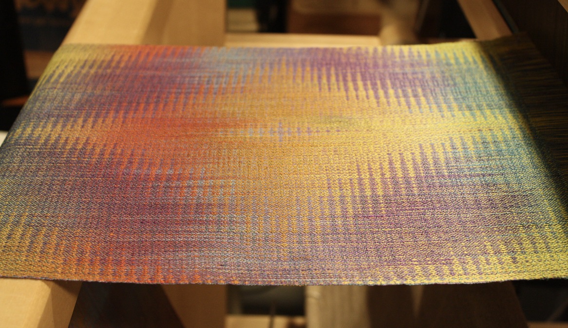
And let me take this one step further, to show you a sample I wove on four shafts using four seemingly discordant colors in the warp.


This is a 4-end parallel threading on 4 shafts.

Here, the four colors in the warp are red, orange, chartreuse and turquoise: two sets of complementary colors (red/chartreuse and turquoise/orange). I'm guessing the weft is a bronze color, which is again a sort of "mediator" among the four, in a medium value and a fairly unsaturated hue.

I don't always practice what I preach, however, which is urging weavers to choose colors out of their comfort zone, understanding that the weft can make such a difference. What happens when I don't follow my own advice?

A fabric like this, which has an attractive pattern (in Echo on 16 shafts) -- but one that is hard to see because the colors are too close in hue and value. The warp colors are royal blue and aqua and the weft is black, if I recall correctly.

Nice, in my opinion, but no cigar

Right now I'm planning an inaugural piece for my new (to me) 32-shaft Megado. I've designed a 32-shaft extended-parallel-threading pattern in two warp colors.

Detail of 32-shaft pattern in Jin

You can't tell, but the warp colors in this drawdown are royal blue and aqua -- the same colors I used for the not-as-successful piece in the prior photo. The weft is a red/orange color, a complement to the warp colors, which makes it work. 

I originally planned to go with these two colors for my warp.


These are what you call "analogous colors," meaning that they are near each other on the color wheel. And yes, they will work for an Echo design -- but I'm thinking that, based on my recent experience, they won't create an exciting design, even when woven with a complementary color in the warp. It's a safe choice, you might say.

So I decided to take my own advice and make my warp-color choices by thinking out of the crayon box. And here's what I'm using.


Colors of a sunset, way out of my comfort zone...

I will keep you apprised, hopefully in my next blog post. Thanks for reading!


Monday, December 21, 2020

More Explorations in Extended Parallel Threadings

Pictured here: a 12-shaft design woven on an Echo threading in 20/2 silk. I call this design "Burano" because it has a lacy look, reminding me of the lace-makers on the island off of Venice. 

So let's walk through the steps in creating this design and weaving the different samples in Echo, Jin, Shadow Weave, Rep and Double Weave. (This is exactly what we do in my workshop, "One Warp, Many Structures: An Exploration of Extended Parallel Threading." I must really like the process, because I keep repeating the format on my own, at home....)

First, how to create the design itself? I think I found the original pattern, a twill pattern with elements of a Crackle threading, on Handweaving.net. Can't remember, exactly, because it could also have been on Pinterest. Both are great places to scan weaving drafts for ideas. Here's what the original draft looks like.


Intricate, symmetrical, appealing -- reminds me of a butterfly! I starting playing on Fiberworks, expanding the design to 12 shafts using an extended parallel threading. And this is one of the designs I came up with: an Echo tieup on an advancing and descending twill treadling.


Following one of my other workshops -- "Paint Two, Beam One" -- I hand-painted two warps of 20/2 silk. The first was in a range of blues and the second in purples and rose colors, but I decided I needed more color, so I added two more painted warps in complementary colors, creating four stripes bordered on both sides by two ends of black. And here's how it wove up. 


This sample is the same pattern as in the first photo of this blog post. I used a bronze-colored weft in 20/2 cotton, because the gold tones really warm up the overall tones of the warp. And then I proceeded to weave up samples in Echo, Jin, Shadow Weave, Rep and Double Weave, varying my tieups, treadlings and weft yarns, all on the same extended parallel threading.

I am so grateful to my weaving teachers, particularly Bonnie Inouye and Marian Stubenitsky. I first learned about the potential of extended parallel threadings through a workshop taught by Bonnie, "Opposites Attract," in which she explores the potential of Echo threadings to achieve a broad range of structures. And I also continue to learn from Marian Stubenitsky's definitive work, Weaving with Echo and Iris, in which she took Echo designs and ran with them, showing countless possibilities for variations on 4 to 32 shafts.

Here's how my Jin sample wove up, offering yet another example of why I love Jin so much:


And here's how the threading works with Shadow Weave, shown here in a detail:


As for Rep (below): Well, not so great, but I think it was partly owing to my choice of wefts, where I alternated 20/2 cotton (thin weft) and black rayon chenille (thick weft). I think this sample would have been better if I changed my sett, making it much denser, and chose something thicker and less textured than the chenille for the thicker weft. Nevertheless, I see some potential here!


And then I wove up a double-weave sample, which I also like very much:


Just one more, this one in another variation of Echo:


Subtle, yes, but still I like it -- particularly the way the diamond shapes change in both size and color throughout the stripes.

Weaving at home and teaching weaving on Zoom have both given me great comfort this past year. And we all need comfort, even as we are painfully aware of how others lack food, shelter, health care and health itself. This year has given us hardship and hope in equal doses. Friends and loved ones are farther away and closer in our hearts. May you and yours enjoy the blessings of this season of light, however you may celebrate, and may you take comfort in every way you can in the year to come!


Tuesday, November 17, 2020

Gebrochene, Echo and Jin with Fiberworks: Putting 'The Earl' Through His Paces


Ah, the old Weaver's magazine... such an endless source of inspiration! Recently, I was looking at an issue from 1997 and came upon a story by Marjie Thompson about the source of the above draft, "The Earl's Canvas." (Thanks to Thompson for sharing it with me.) She had given a talk to our guild about this years ago and I never forgot the beautiful silk scarf she wove. 

The pattern was discovered in a portrait of John Erskine, second Earl of Mar in Scotland, in the National Portrait Gallery in Edinburgh. Painted in 1626 by Adam de Colone, it features a Jacobean noble with a lace ruff and badge of office. 


What's interesting to weavers, however, isn't the painting itself, but rather the canvas it's painted on. According to Thompson, a museum curator analyzed the pattern in the 1970s and found that it's actually a 14-shaft Gebrochene design that was probably an old tablecloth. 

And what is Gebrochene (pronounced in German "geBROKena")? Literally it means "broken," but to weavers it's basically M's and W's. According to Thompson:

"It's a twill interlacement with an elaborate threading and treadling and a twill tieup. Usually both warp and weft are the same yarn, historically linen. Gebrochene tablecloths are pictured in medieval art and Gebrochene drafts are found in... books from the early 17th century. Patterns can be quite elaborate; one design by Jacob Angstadt shows over 900 ends in one repeat."

At last we get to the point of this blog post, which is: This beautiful draft can easily be translated into an Echo threading. And a Jin design. And Shadow Weave and Rep and Double Weave, all through the magic of Fiberworks.

You start by reducing the "The Earl" threading to 8 shafts (because not everyone has a 16-shaft loom). Next, under the Treadling dropdown menu, select "Weave as drawn in" and then make the treadling tromp as writ. Then select "Draft" and "Thickness" and click on "Exactly as drawn."


Next, using the Warp dropdown menu, click on "Parallel Repeat." In the box that opens, select "Extended Parallel," "Shafts shift by 4" and "Also duplicate colors and spacing." Then click "Apply." (And then "Close.")


Next, still in the Warp dropdown menu, click on "Fill Warp Colors." In the space that says "Single Color A," scroll down and select "AB." Then click "Replace." (Because this is just an exercise, I've simply gone along with the pre-selected colors in boxes A and B in the "Fill Warp Colors" box. You can select your own colors by using your cursor to drag colors from the "Colors" column that appears when you click on "Fill Warp Color.")

Hard to see in the above image, but if you look closely you can find blue and aqua in the boxes above the threading, indicating the colors of the warp threads below.

Next, create a 4/4 ascending twill tieup, which is a classic Echo tieup. The elementary way to do this is to draw it in by clicking on the boxes you want -- but to do it faster, you can just fill in the tieup for the first treadle and then click on the "Tieup" dropdown menu, select "Twill Repeat" and then "Step Up," "Step by 1," "Treadles per group 1" and "Apply."


Yes, it's Echo and yes, the Earl pattern is identifiable -- but it has long floats. (A good rule of thumb, according to Bonnie Inouye, is that floats in Echo should be no longer than 5. This is where the "Float Search" function on the "Tool" dropdown menu in Fiberworks comes in handy.)

Next step, alter the tiedown by breaking it up so that the floats aren't as long. Here's an example.

The motifs are still a bit squashed, right? There are ways to fix that -- one of them being to change the treadling.


Another way to alter the "flattened" Echo draft is to add tabby to the tieup, changing the structure to Jin.


You can alter the Jin design a bit by changing the tieup to create what Bonnie Inouye describes as "decorated Jin" -- changing it from a 4/4 tieup to a 4/2/1/1 tieup (plus tabby, of course).


Now that's a design befitting an Earl, don't you think? At the risk of losing readers, I will show you a few more designs. Here's how the Earl looks as Double Weave (both front and back views).


And here's a Rep version:


And then there's Shadow Weave -- although I'm not sure I like it so much.


So there you have it: "The Earl" as interpreted for extended parallel threadings, 400 years after it was used as the canvas for a nobleman's portrait. 

Thanks for reading!

[For further study: Eva Stossel is a blogger and peerless weaver who wrote about this subject on her blog and in the Complex Weavers Journal in 2012. You can read her blog post by clicking here.] 


Monday, October 19, 2020

Finally... a Design I Like!


In a way, the design is hard to see, isn't it? That's been the problem. This is a 16-shaft Echo pattern on a 60/2/2 silk/ramie warp that I dyed in two color palettes. (I really love doing this: You paint two warps in complementary colorways and then beam them together on the loom. For this Echo piece, I threaded the warps A/B/A/B, etc., so that the pattern and the colors create a lot of dynamic shifts.)

I was really excited as I completed this design, which I call "North Star" in honor of the newspaper edited by Frederick Douglass when he lived here in Rochester, NY, in the mid-19th century. Rochester was a stop on the Underground Railroad and the North Star itself was a beacon for slaves fleeing to the northern states and Canada. It's a beautiful and tragic symbol of hope in dark times. And meaningful, too, at this point in our history.

And so, after lots of experimenting on Fiberworks, I settled on a Jin (Turned Taqueté) design. I'm posting it here in black and white -- because it's really hard to see the pattern in color, the values are so soft.


I really loved the design -- but when I wove it up I could hardly see it. Here are two samples, using a 20/2 cotton weft in olive green (bottom of photo) followed by a sample using a weft of teal blue (top of photo).


The back of the fabric (still on the loom) gives you a slightly better representation of the colors.


Close, yes, but still not exactly what I was going for. This happens all the time to me: I work and work to create a design I like in Fiberworks, but I have to keep in mind that it won't necessarily translate well on the loom. There's a lot of tweaking involved: sett, beat, the grist of the weft yarn, the color of the weft yarn, which treadling and tieup to use.... 

So many options! Does this happen to you? Sometimes I wonder if I'm just chasing a carrot in front of my nose, always seeking that perfect design. Don Quixote would understand....

But onward. Keeping in mind what I say when I teach -- that Jin can soften a design, making it look like it has a sprinkling of dusting powder over it -- I decided to try the Echo version of this threading, avoiding the tabby tie-downs in the Jin treadling, which can obscure the pattern. 

Here's what the Echo drawdown looks like in black and white, again to show you how the motif plays out.

To my eye, this design is stronger and a bit more graphic. And I was much happier with the result. Below is another view of the sample at the beginning of this post, woven with a light aqua weft in 20/2 cotton.


So often with Echo and Jin, the pattern looks bolder when you peer at it from the side, at a low angle, as in this photo. And by the way, I'm really happy weaving on a silk/ramie warp, because it has both a luster (silk) and a grit to it (ramie). Soft cocoons and bristly nettles together. Sort of like the experience of weaving itself ;o)

I hope to have a scarf finished before I teach my next warp-painting class. Oh yes, and I had to order more of the aqua weft yarn....

Thanks for reading!


Tuesday, September 8, 2020

Designing Echo as Double Weave for 16 Shafts


Pictured above: a drawdown of the front of a 16-shaft 4-color double-weave pattern that I just finished designing. (You'll find the tieup for this, as well as a view of the back of the pattern, at the end of this post. I have to go through all my steps in figuring it out before I reveal it to you!)

My inspiration came from Pinterest, where a while back I came upon a design I really admired. 


It was for 24 shafts and I have just 16 on my Toika, but still I had to figure out what made it so appealing. It was for double weave in an Echo threading and the tieup looked like this:


My first reaction was, "Oh boy, here's one of those irregular double-weave tieups that makes absolutely no sense." And my second reaction was, "How did they DO that?" My third reaction was, "I want to do that!" 

I knew that the original tieup had been modified -- "carved" you might say -- to veer off a straight twill angle for some of the shafts, creating interesting and eccentric patterns in the cloth. So I set about adapting the design to 16 shafts, first by breaking the 24-shaft tieup into two sections, one each for the top and bottom layers of the original 24-shaft draft.

Here's what they look like.

Tieup for the top layer

Tieup for the bottom layer

Back to Stubenitsky's Echo and Iris, of course. On page 89, she lays out her method of designing double weave tieups based on what she terms a "ratio." (Note here: Of all the listings in the index of this book, "Ratio" is cited the most. Something to ponder.)

She begins with what she calls the "ground tie-up." Below is what the ground tieup looks like for a 16-shaft double weave in Echo. For both layers, this ensures that half of the shafts will weave plain weave throughout. (You can't really weave anything with this tieup; it just gives you a stable ground for creating designs using the other half of the shafts.)


It isn't as inscrutable as it may first appear. On treadle 1 (for the top layer, which is treadled with all the odd-numbered treadles), you'll weave plain weave by raising shafts 1, 3, 5 and 7. On treadle 2 (for the bottom layer, which is treadled with all the even-numbered treadles), you'll weave plain weave by lifting shafts 10, 12, 14 and 16. 

An aside: With double weave, the shafts that are "raised" to weave the bottom layer are actually being lowered from the perspective of the bottom layer, because the bottom layer is weaving upside down (from the weaver's perspective). It's helpful to think of the tieup for the bottom layer as a sort of photo negative, where up is down (black is white) and down is up (white is black).

Note that the second half of the tieup for both layers is totally blank. That's where Stubenitsky's ratio comes in. For this, I tried a tieup with a ratio of 4:4, meaning that, in the second half of the treadling above the ground tieup, 4 shafts are raised and 4 shafts are down in an ascending order for both layers (top and bottom layers, on odd and even-numbered treadles).

Here's how that 4:4 ratio looks.

Next I created a tieup with a 5 to 3 ratio, which looks like this.


Here's a 6 to 2 ratio:


And finally I designed a 7 to 1 ratio:

So here is what the drawdowns look like, respectively.


4 to 4 ratio


5 to 3 ratio


6 to 2 ratio


7 to 1 ratio

And here, below, is the grand finale: what I call a "carved" tieup for this pattern on 16 shafts (the pattern that appears in the first image of this post). 


And here's the image of the back of the drawdown for this (again, the front is the first image that appears in this blog post).


I like both sides quite a bit, but the problem is that there are quite a few warp floats of 7 picks. Not great, really, but then again, I'm considering that this is double weave -- so 7 divided by 2 layers is really a float of 3.5 for one layer. Round that up to 4 and it would be acceptable if this were Echo or Jin, so maybe it's not a problem?

More to ponder... Thanks for reading!


Name Drafts Aren't Just for Overshot....

  Above is a name draft using -- why not? -- the name Michelangelo, employing an Echo threading and a twill tieup and treading. A name draft...